2020 central MN AdFed student best in show & gold award
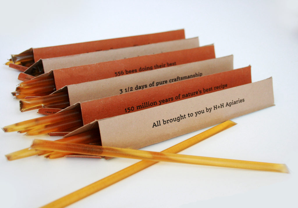
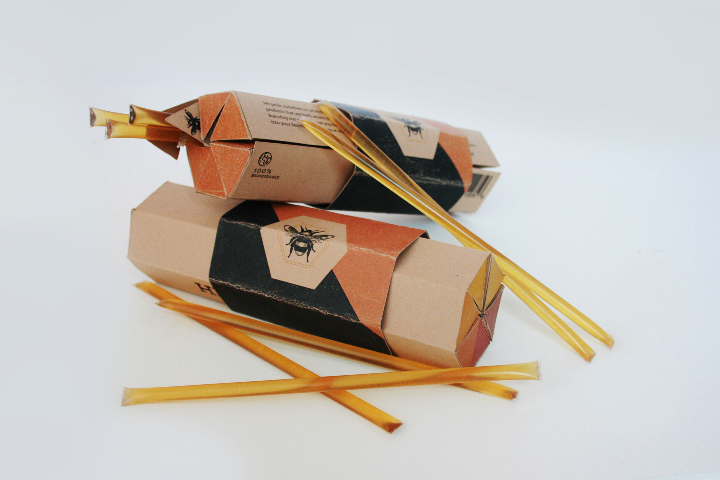
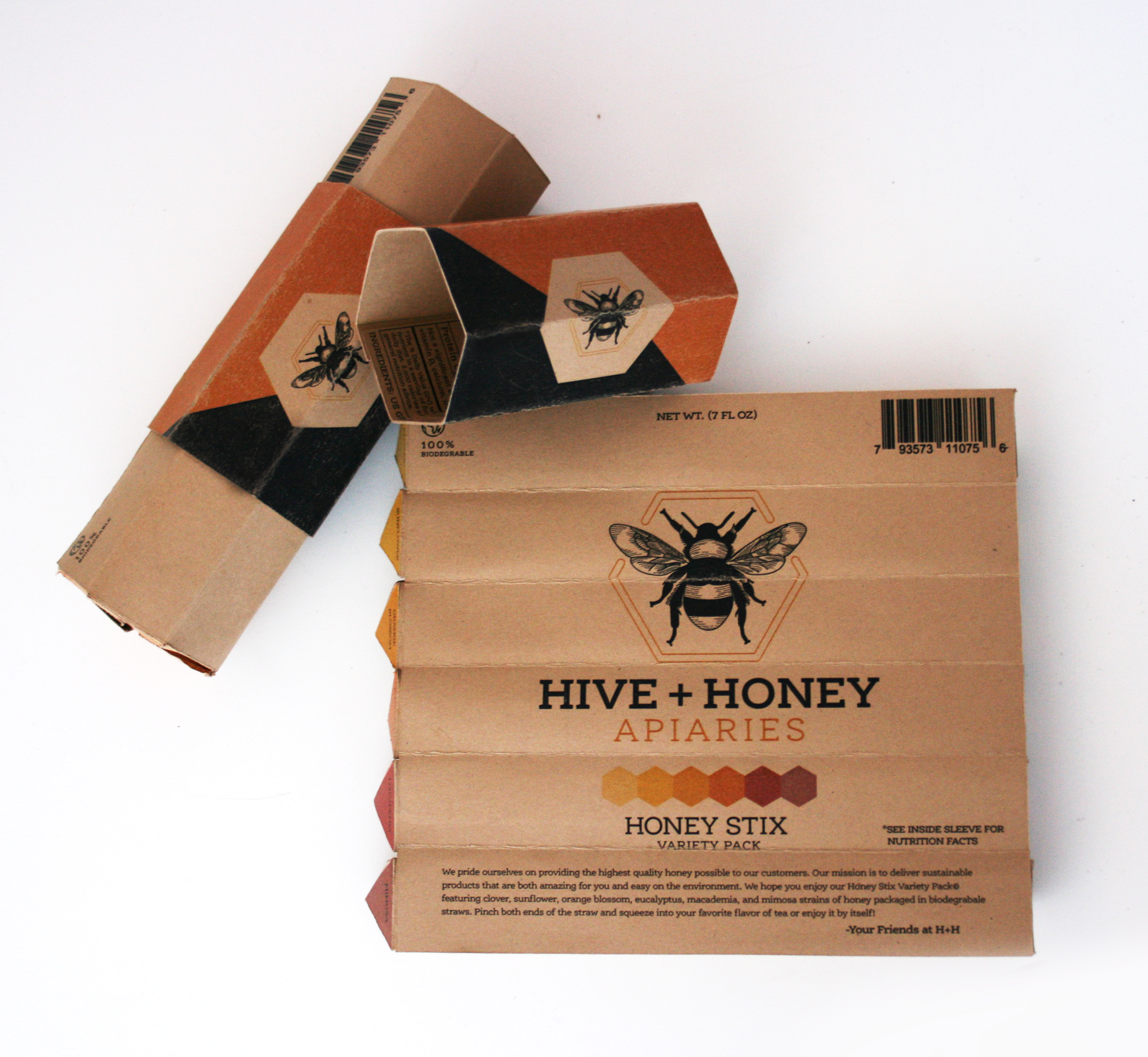
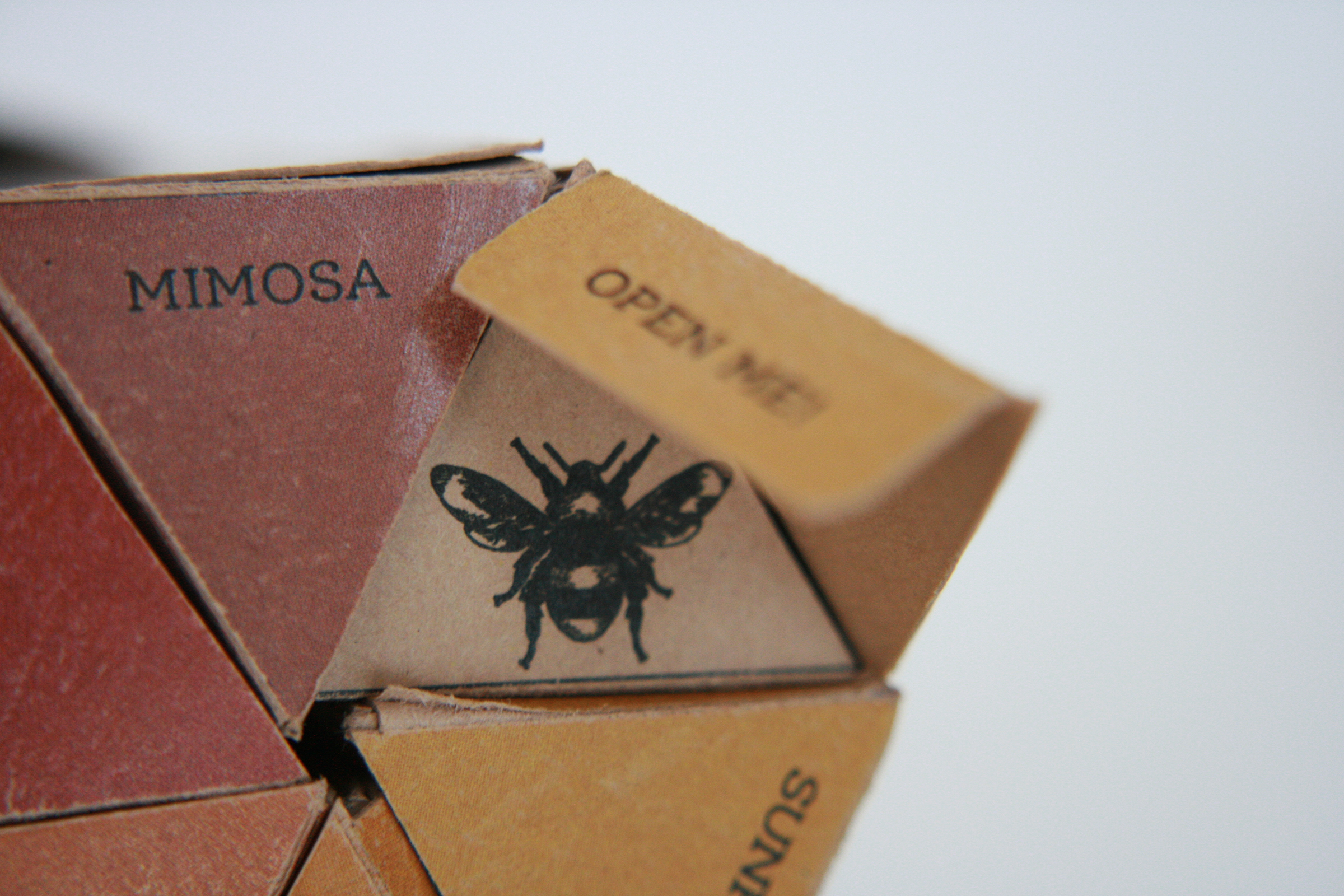
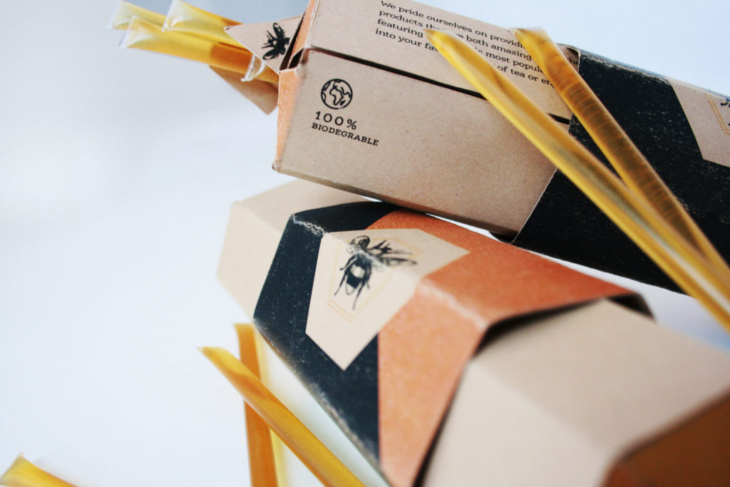
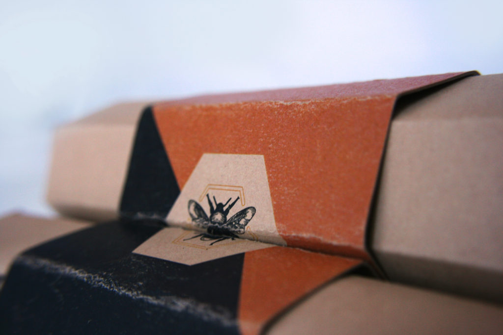
Hive + Honey is a unique brand of honey sticks that brings interactive and discoverable packaging to a simple and sweet product. Inspired by the hexagonal honeycomb shape, this product invites the consumer to explore different artisanal flavors of honey wrapped in experiential packaging.
OBJECTIVE
While crafting this project I was challenged to find an inventive way to contain one of my favorite sweet treats, honey sticks. The goal I had in mind was to find a way to separate the different flavors of honey while keeping a cohesive form that fits with the product. The aim was to create a package that invited investigation and discovery as the consumer unfolds the package.
STRATEGY + SOLUTION
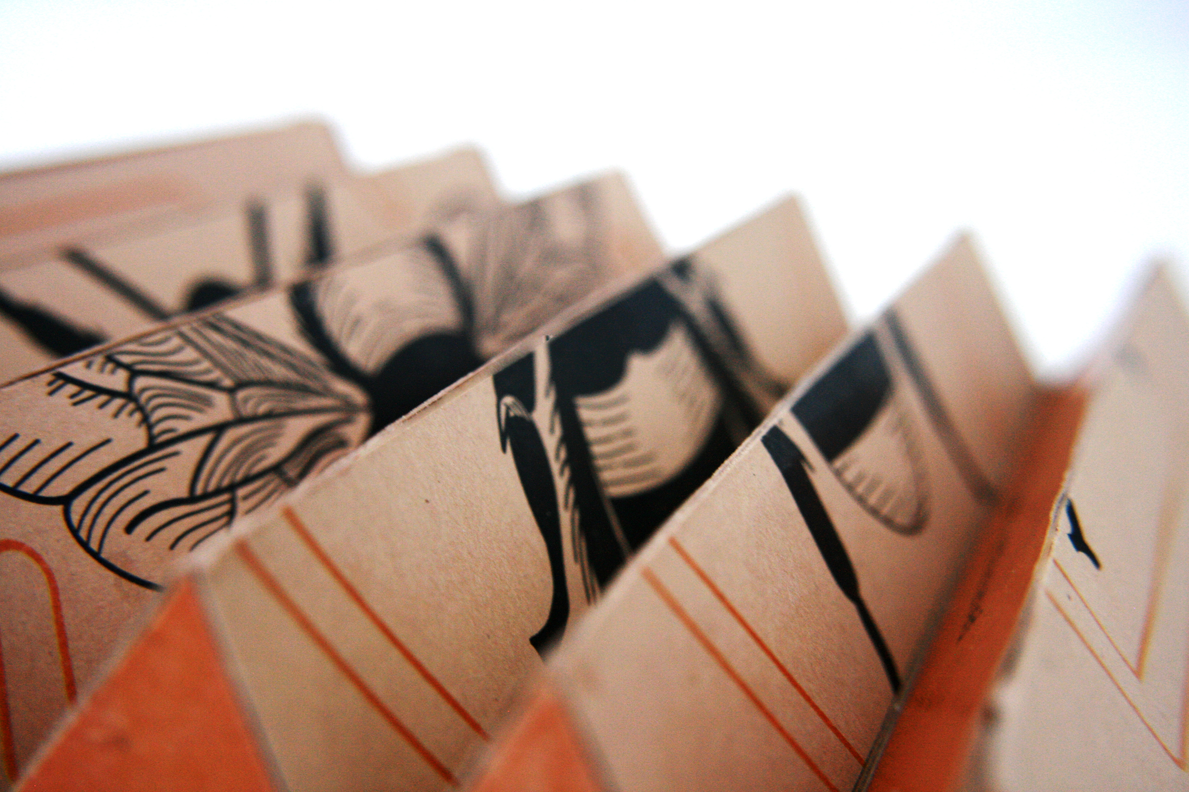
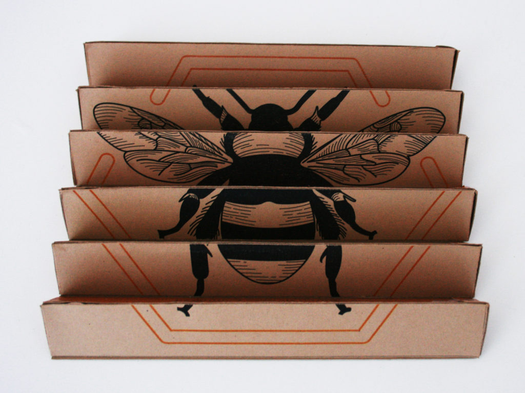
I began solving this challenge with inspirations from holographic playing cards and chocolate bar packaging. Holographic playing cards have multiple images printed on a surface that changes the image based on the viewer’s perspective. I understood this perspective-based thinking would create an opportunity for my package design by allowing the user to view two different images by shifting the position in which they viewed the package once opened and rolled out. To consider how to contain the honey sticks, I found inspiration from the classic triangular prism packaging of chocolate bar company, Toblerone. Combining these two inspirations I was able to manufacture a die line that would also be able to roll into a condensed hexagonal prism shape. This was executed by creating six triangular prisms and adhering them together against a single back panel.