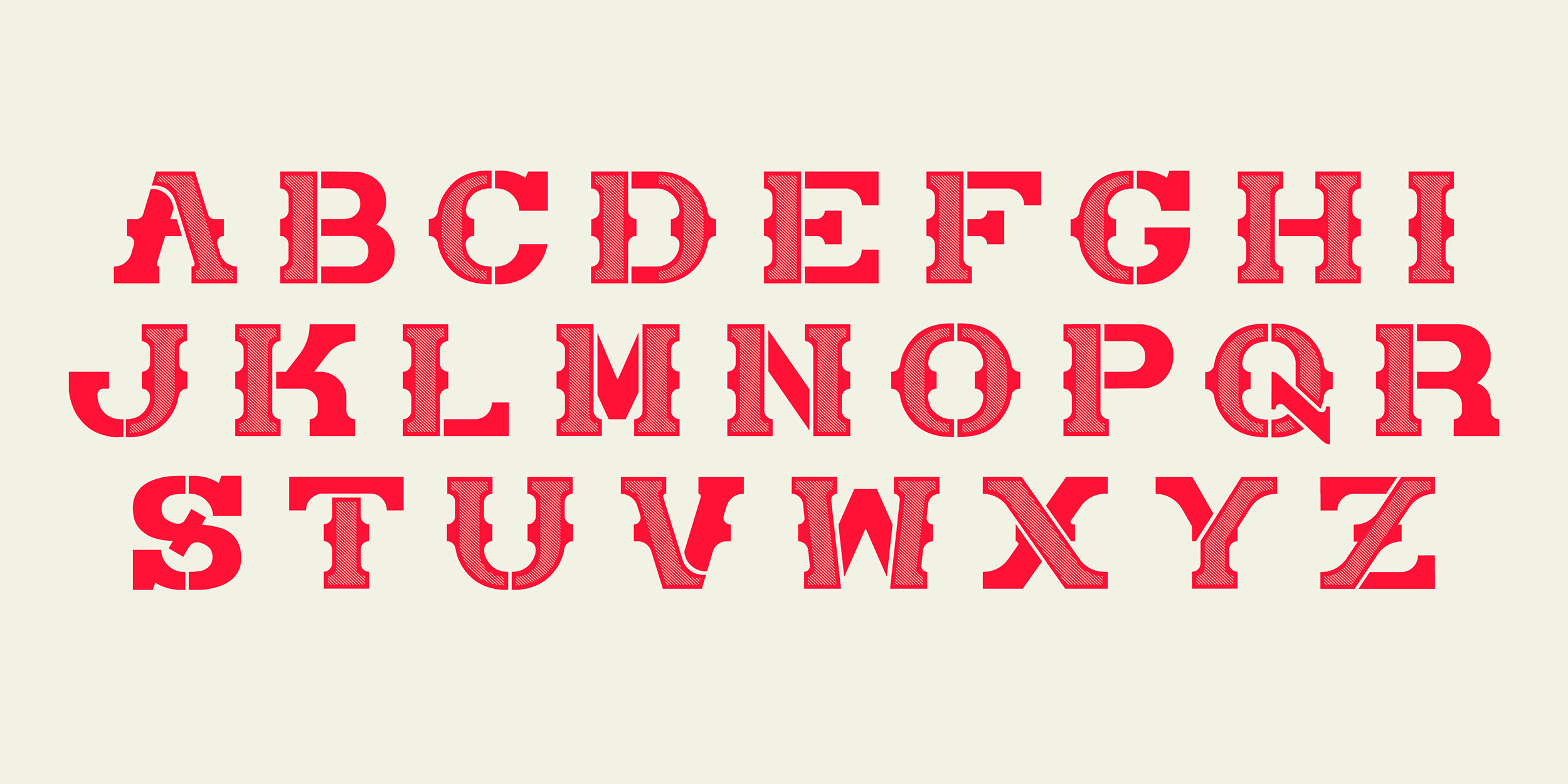
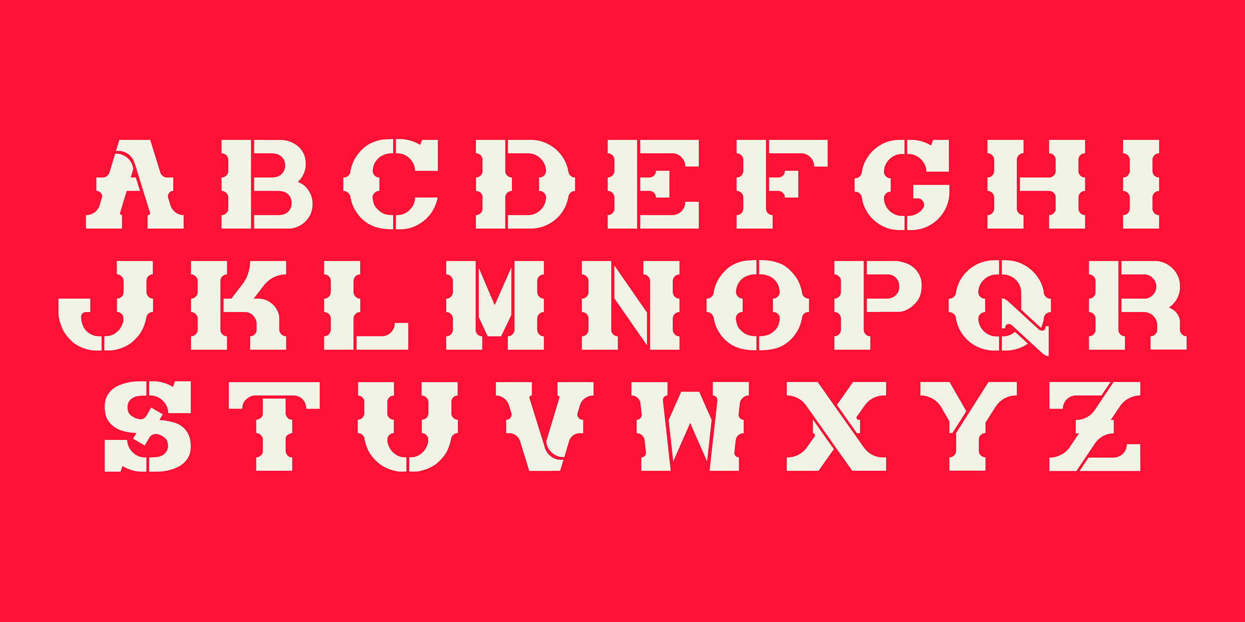
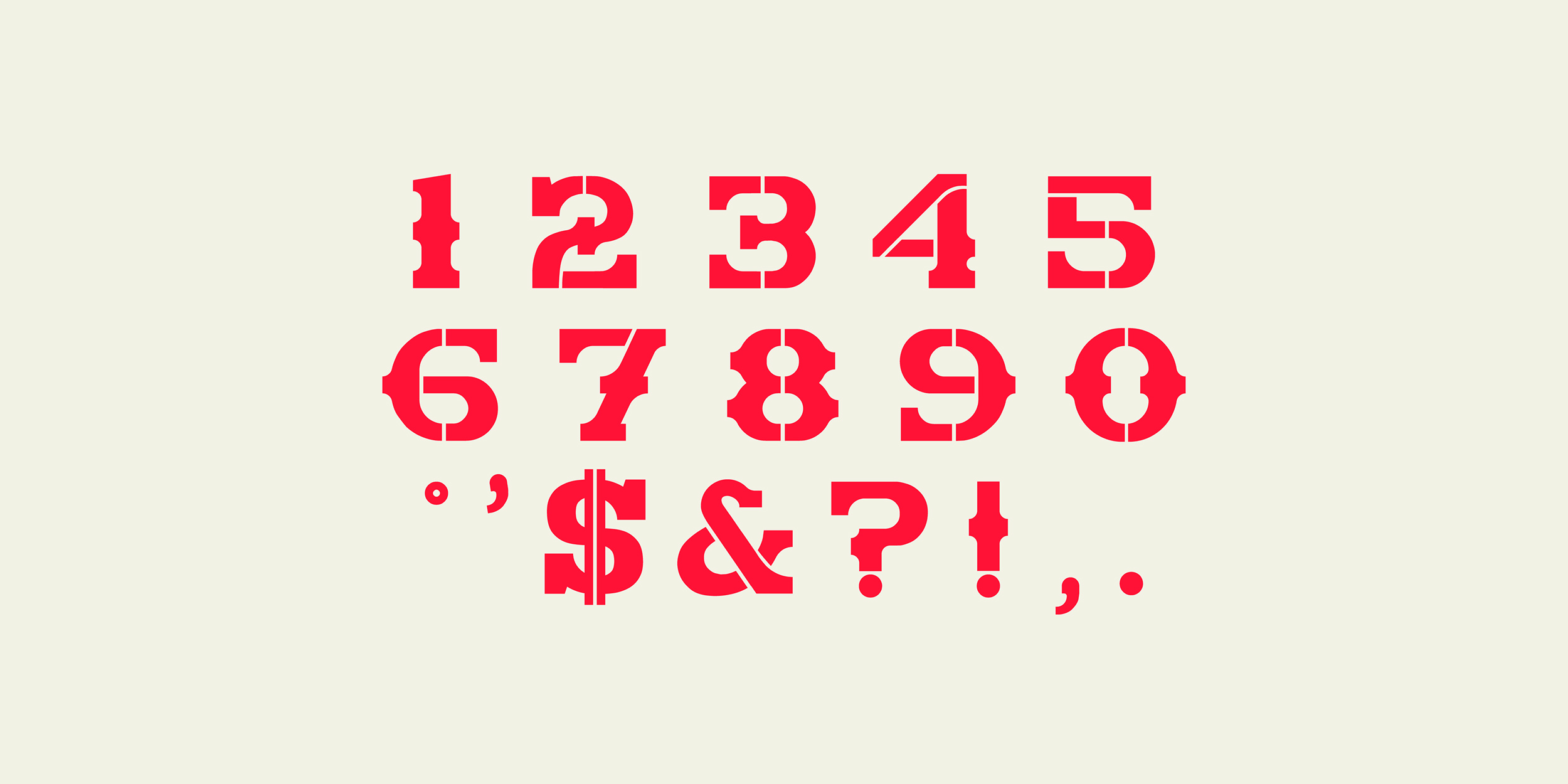
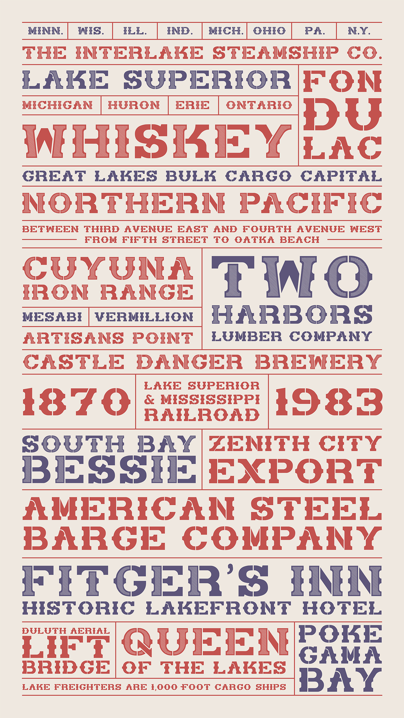
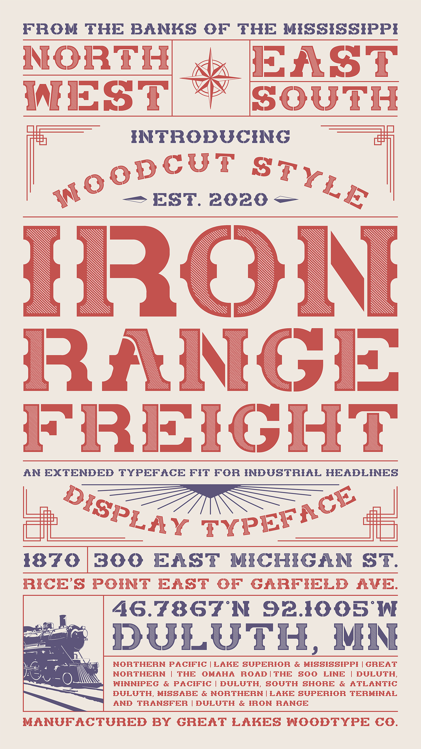
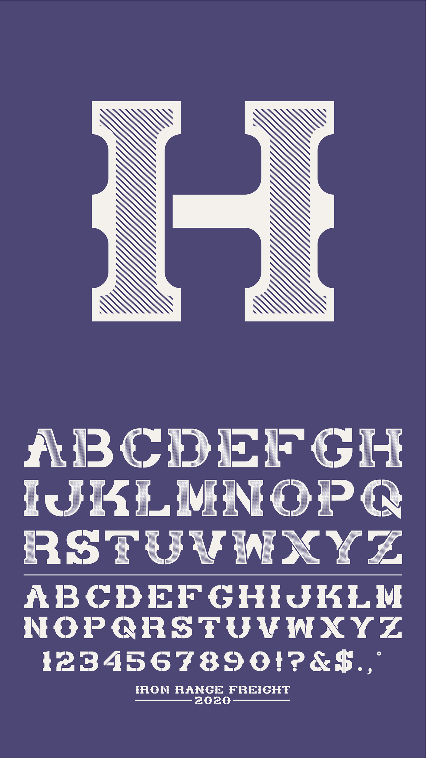
Iron Range Freight is a new age font inspired by traditional display fonts of the 19th century. Crafted with industrial inspiration and created with modern purposes in mind, this display font is made for rugged and bold headlines.
OBJECTIVE
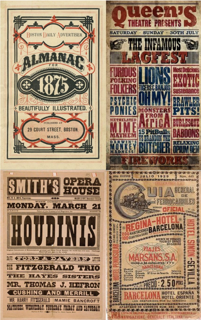
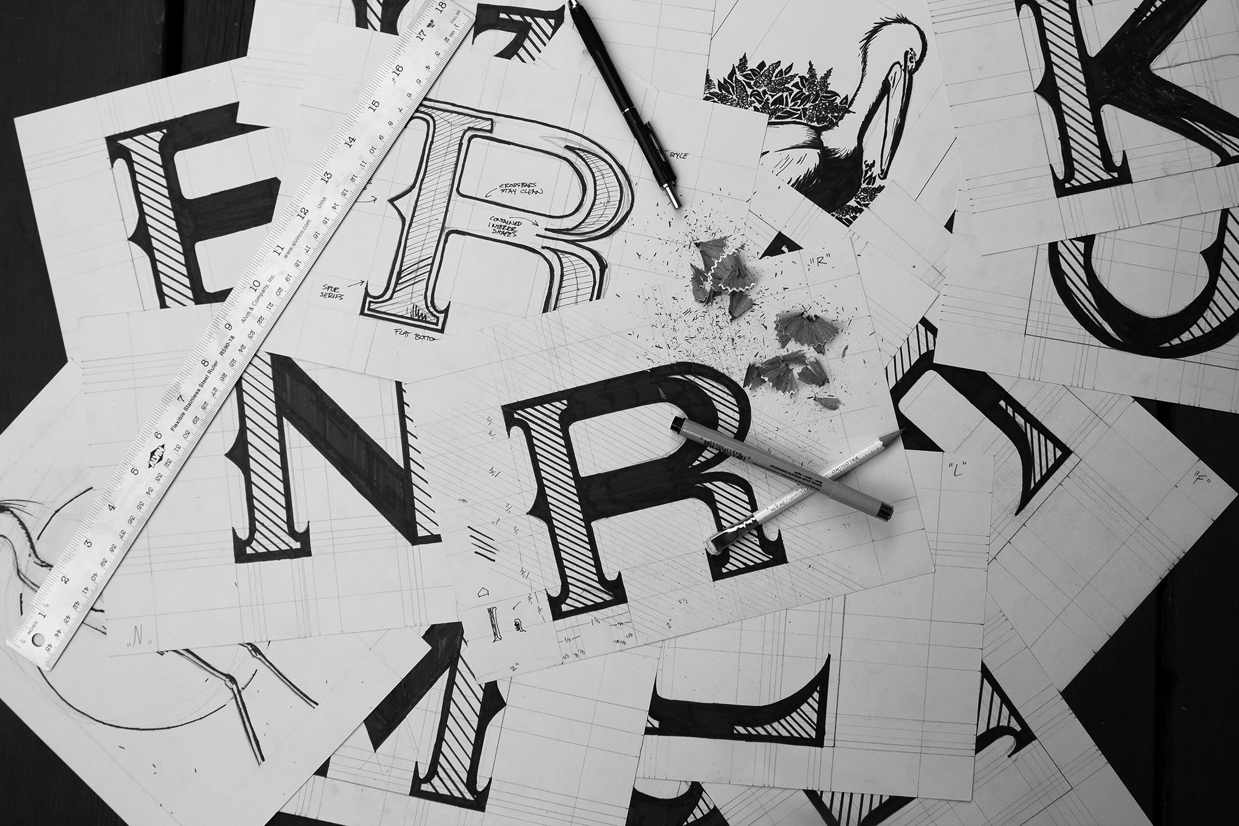
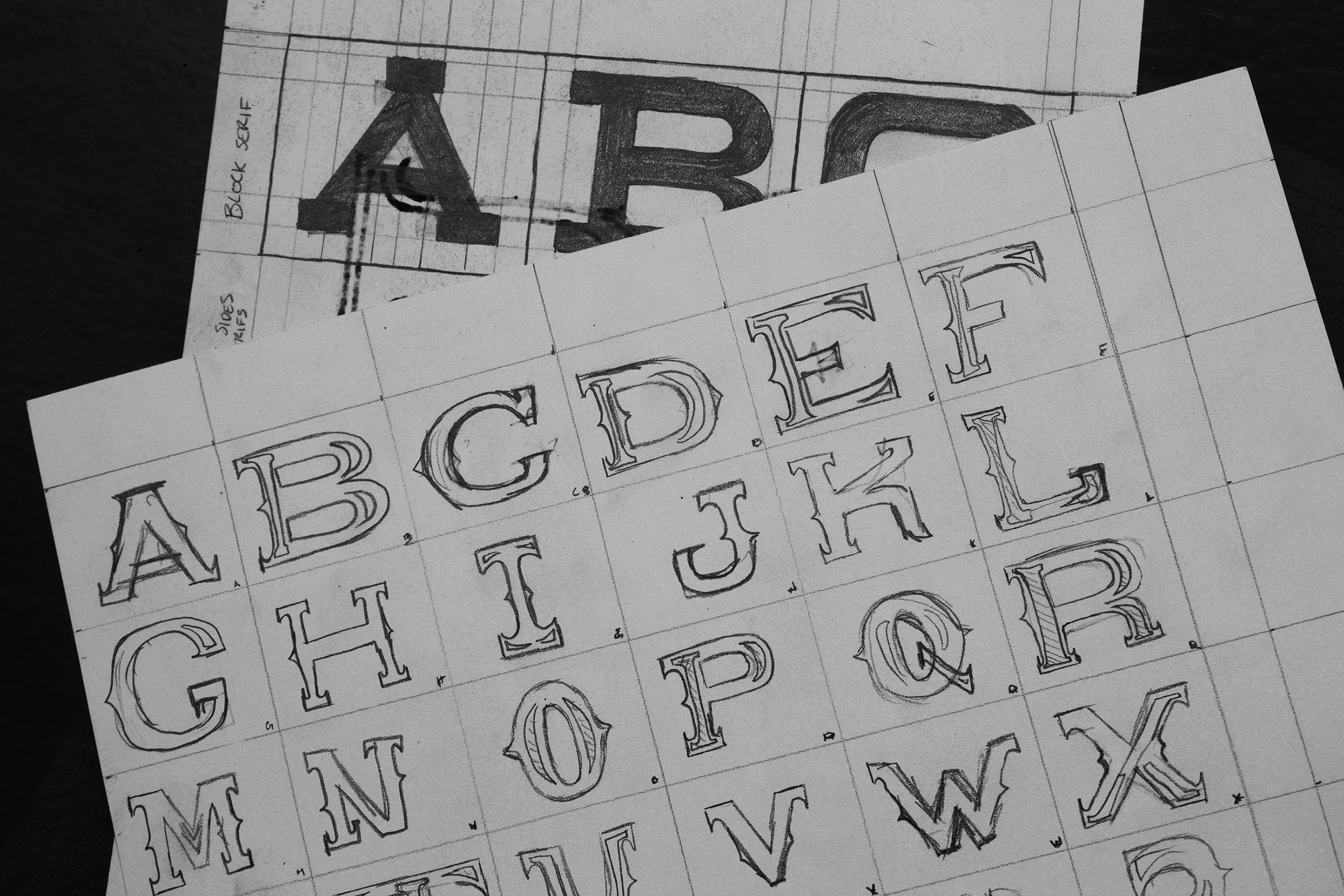
My challenge was to create a font made for displays that was both functional and unique. After researching the history of display fonts I came across the explorative and nonconventional fonts and letterforms of the 19th century. Famous for the over-the-top slab serifs and wacky caricatures for letterforms, the 1800s proved to be a source of inspiration behind my development of this font. What use would a typeface like this have today? What would that font look like?
STRATEGY + SOLUTION
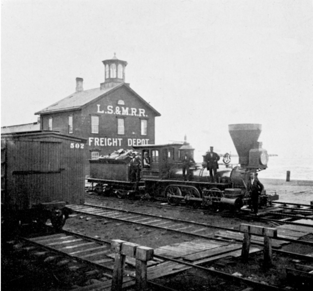
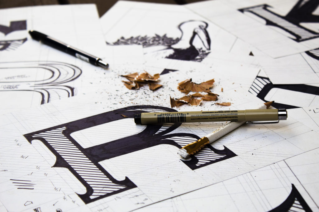
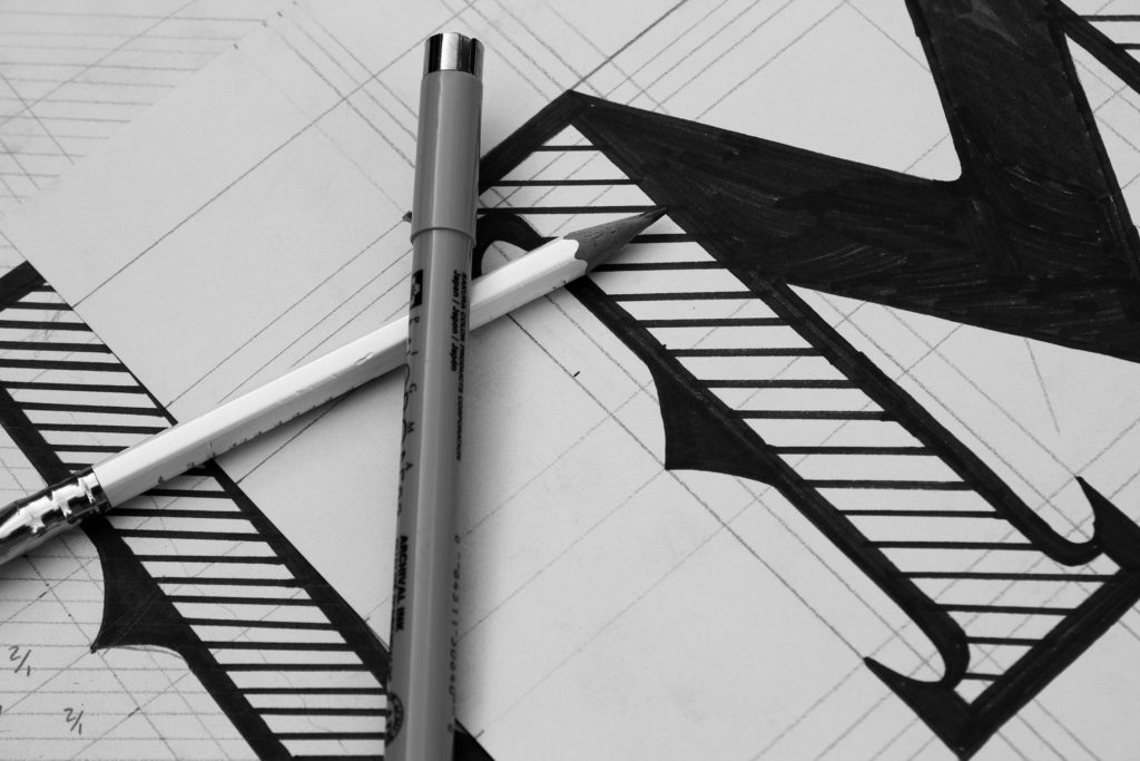
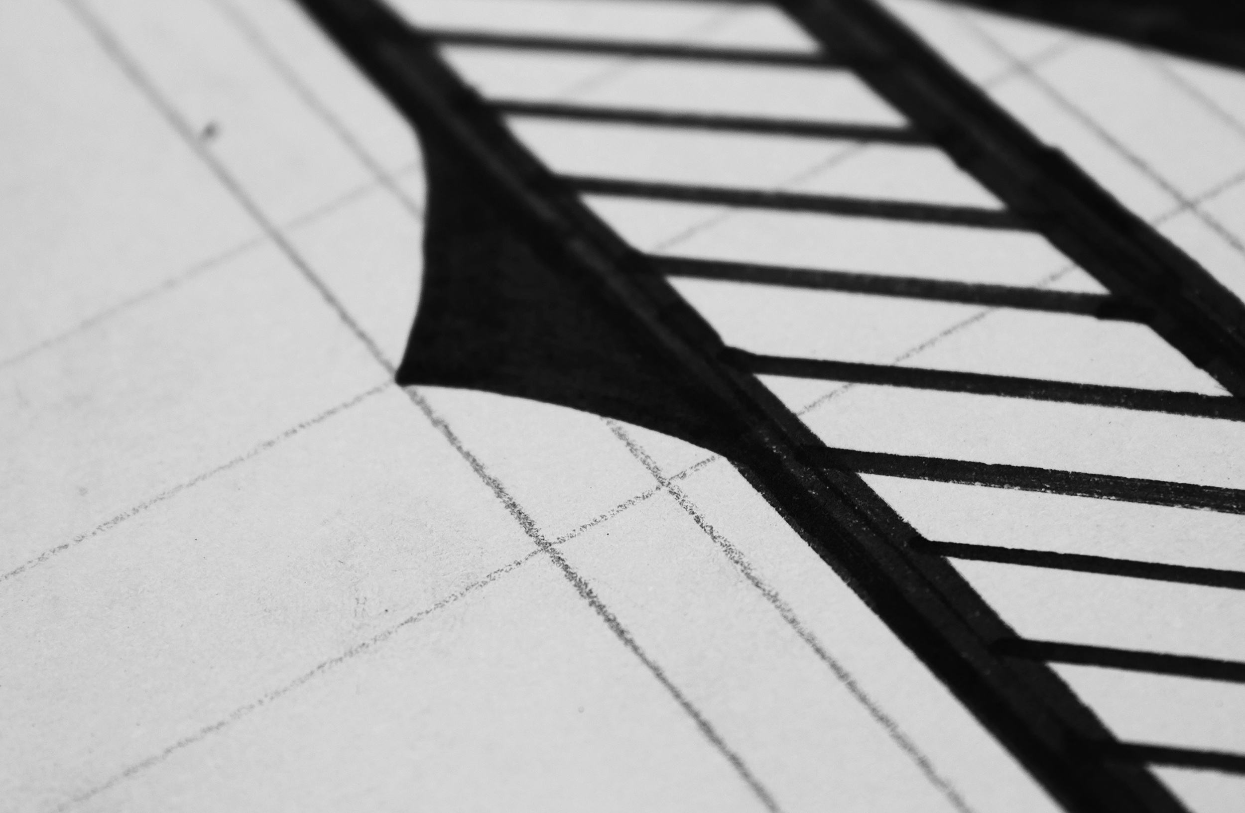
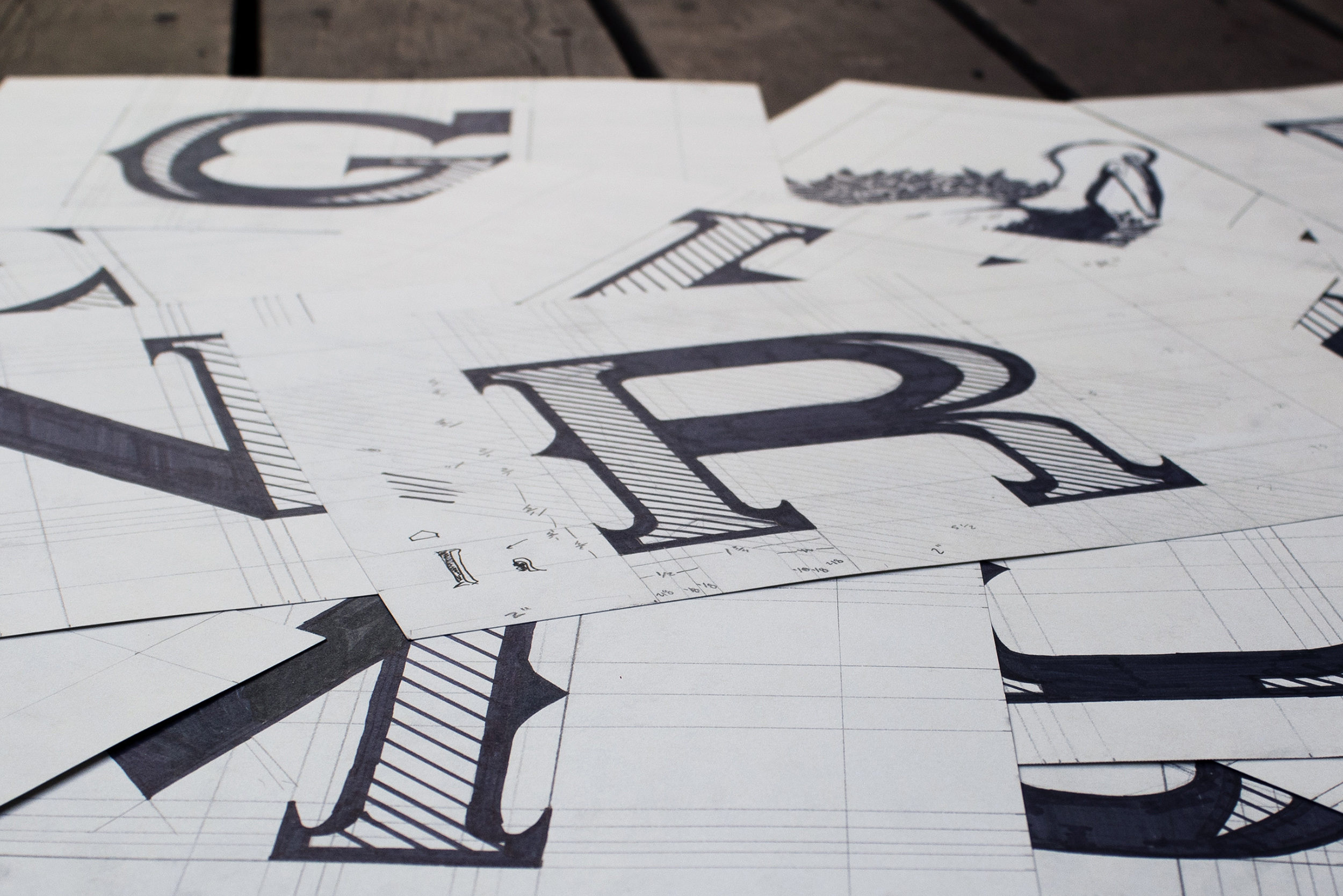
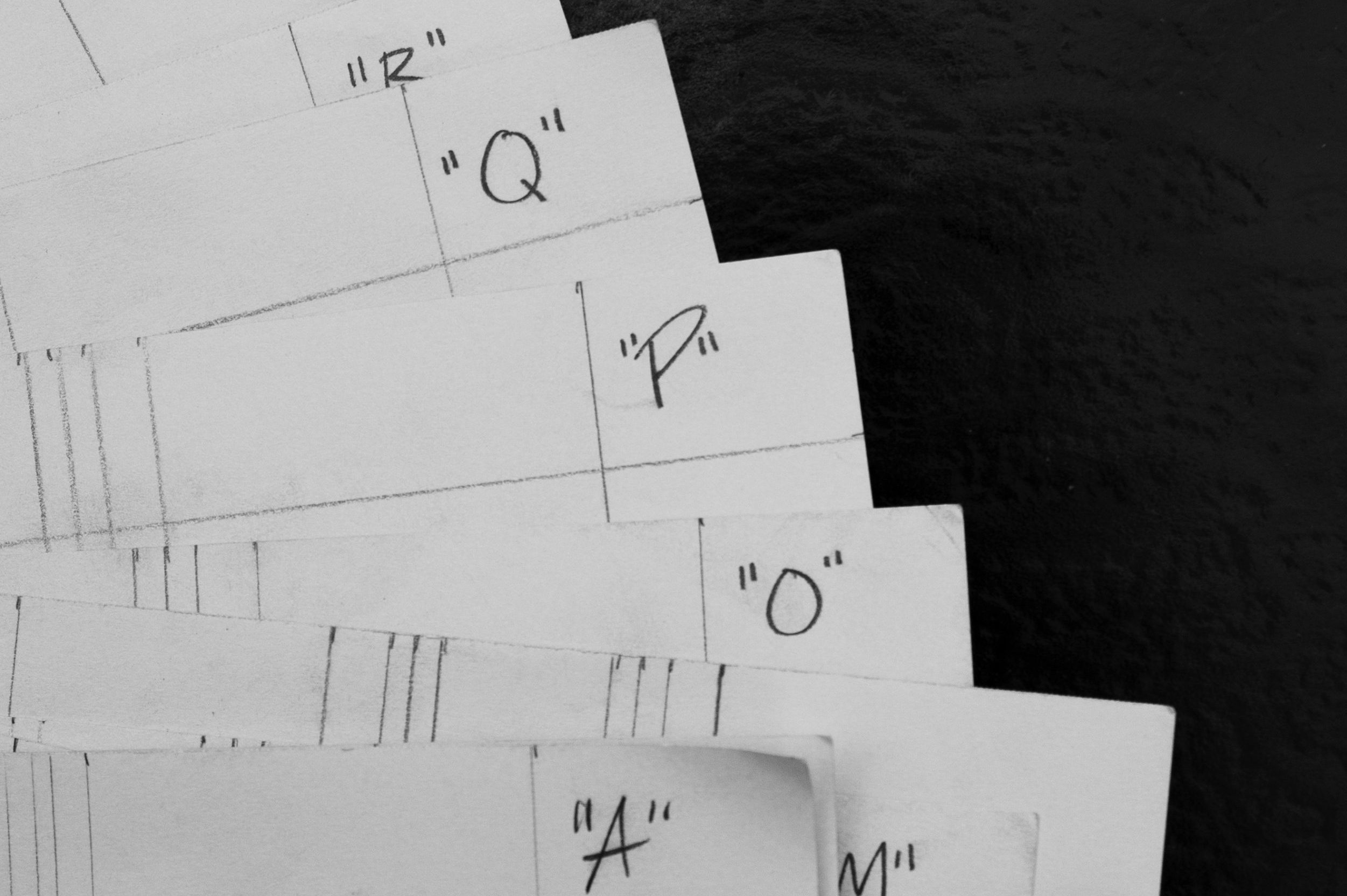
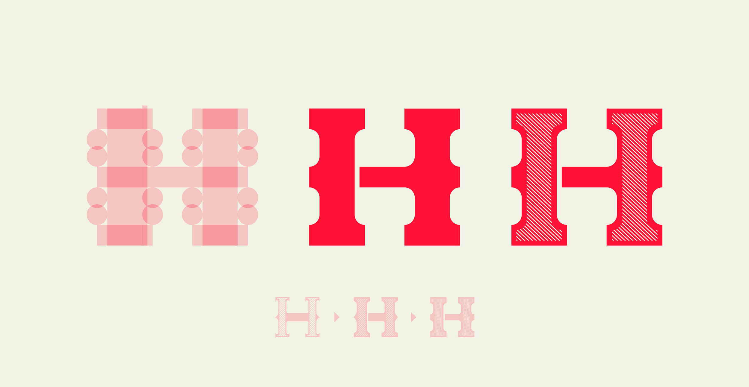
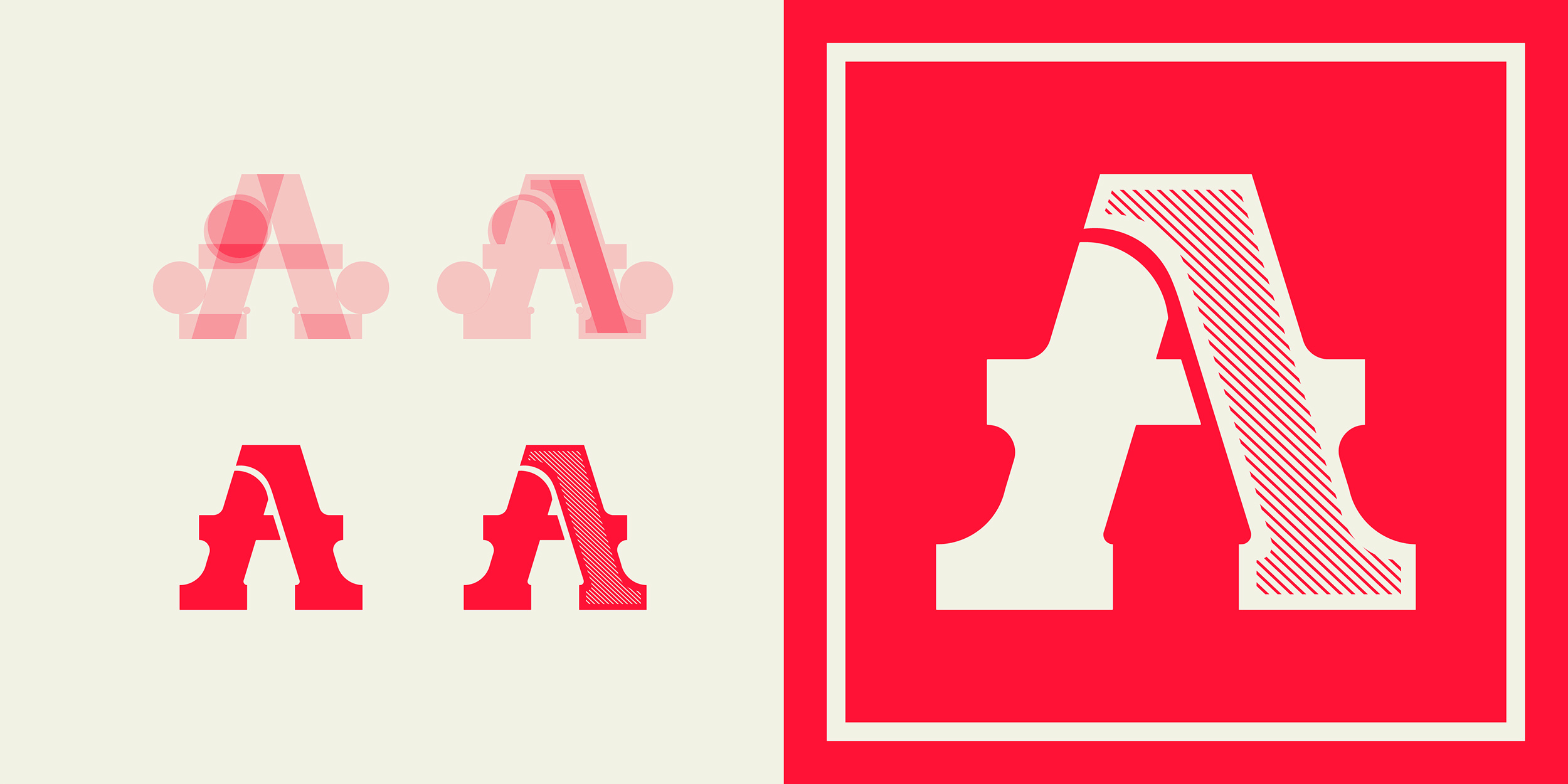
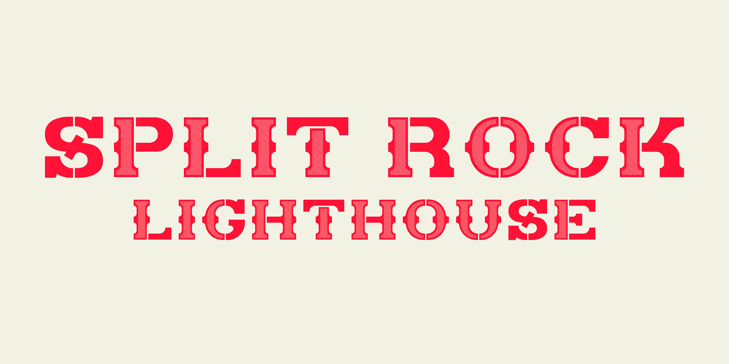
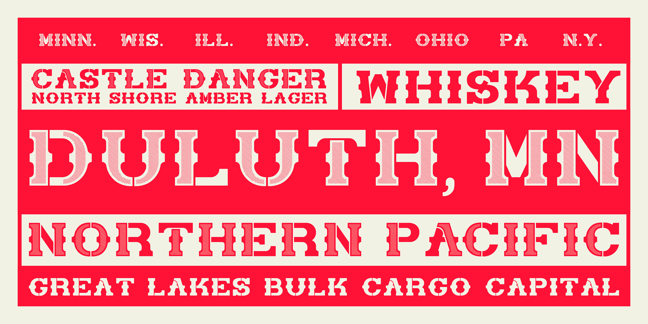
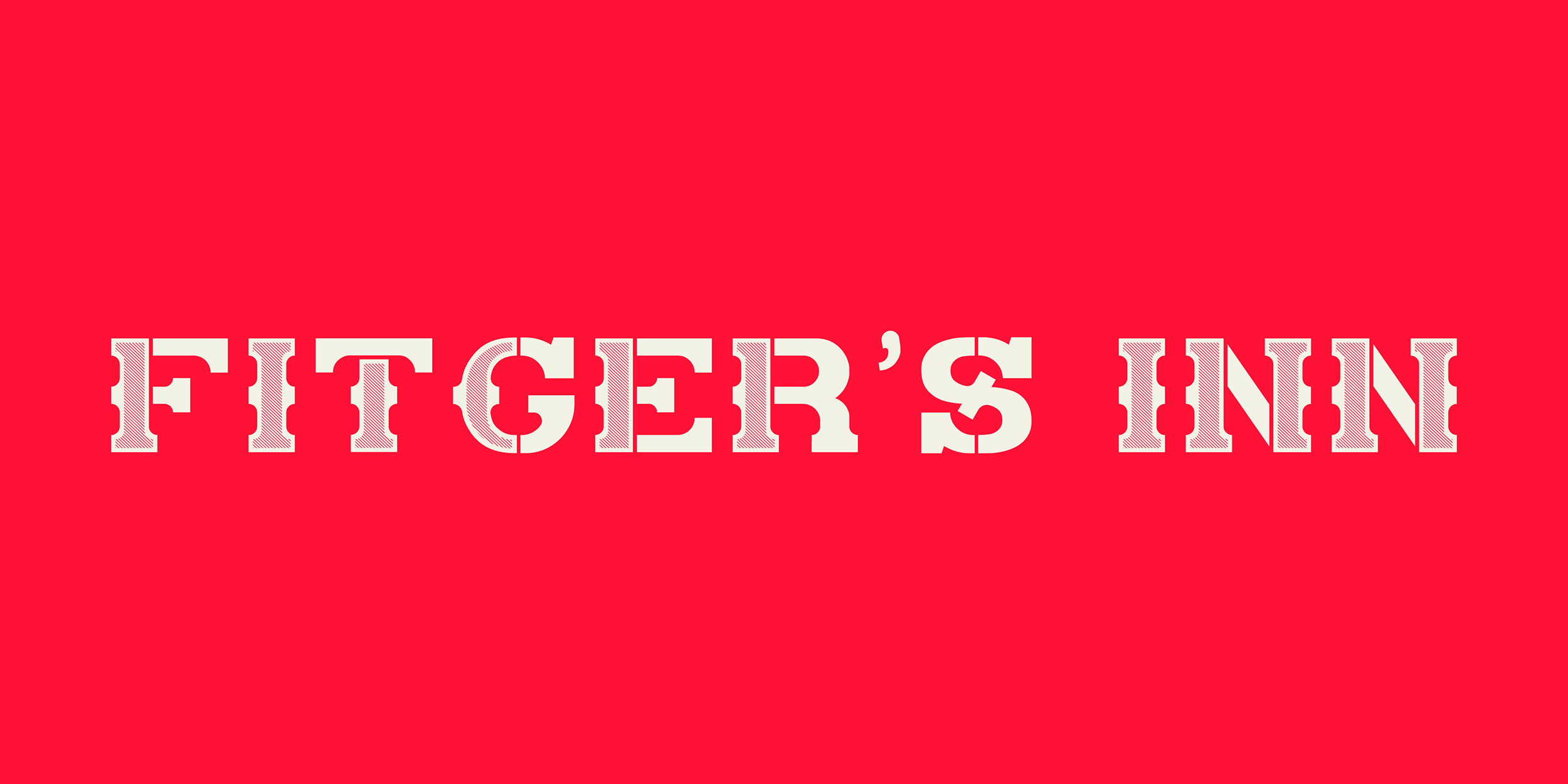
Inspired by the slab serif headlines seen on the railway cars and billboards of Duluth, Minnesota, this project was driven by a source of nostalgia from my own childhood. Starting off as large reference sketches, this typeface went through many modifications until the system of forms felt right in both design and function. To create these forms, I utilized Adobe Illustrator’s shape building software and worked off of a series of repeating shapes to create the lettermarks. Albeit an unconventional approach to type design, this system proved to be an opportunity to explore the different conventions and expectations of fonts.